The Simplicity Cycle Manifesto
 Start with nothing.
A blank page.
A white canvas.
An empty bowl.
Now add something to the receptacle.
A word. A sentence. A paragraph. A line. A splash of color. A shadow. An ingredient. A spice. Heat.
The addition has two immediate effects:
First, the product becomes more complex because it now contains more pieces, parts, and components.
Second, it becomes better because it can now accomplish things previously out of reach.
The page now communicates an idea. The canvas now depicts an image. The bowl now provides flavor and nutrition.
Continue adding and we see the very nature of our creation expand.
Words and sentences give rise to a point, a plot, a lesson, a laugh. Lines and colors produce new sensations of depth, movement, beauty, emotion. Ingredients blend, emulsify, cook, and ferment to release calories and flavors that were previously locked away and unavailable to us.
These additions and combinations provide new value, far more than the sum of the parts.
The same pattern exists beyond making books, paintings, or baked goods. It happens when we create software and spacecraft, PowerPoint presentations and process diagrams, user interfaces and organizational structures, buildings or beers. We introduce new elements to the things we make, and these elements make the thing better.
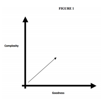
Figure 1 depicts this trajectory as a line moving from a point of low complexity and low goodness
to a higher degree of both values.
We follow this path, this additive design pattern, because we have a story to tell, a picture to show, or a hunger to satisfy. The empty page,
canvas or bowl on its own is inadequate. Simplistic. Underwhelming. So we introduce new elements, resulting in a richer, layered,
more substantial new artifact. So far, so good.
But then things get tricky.
We have now built up a certain amount of momentum and established patterns of behavior that eventually become counterproductive. Yes, things are going well at first, but just around the corner lurks a subtle danger borne of complacency. If we are not careful, we will miss the signs that our situation has changed and that we too must change.
Recall, we started with nothing. Now we have something. The receptacle is no longer empty. This makes all the difference.
Through carelessness, inattention, or miscalculation, we may inadvertently overfill it to the detriment of the whole. Additions once led to improvement. Beyond a certain point, that is no longer the case. Additions begin to make things worse.
When our additions get out of control, the plot becomes jumbled, the colors muddied, the flavors discordant or overpowering. The new pieces do not simply add less than the previous pieces—they actually diminish the value of the whole.
Our initial experience may have led us to expect the trajectory in Figure 1 to continue indefinitely.
It does not.
It cannot.
Instead, there is an inevitable, unavoidable bend in the road. If we keep adding elements to the design, we will find ourselves heading in a new and undesirable direction, as shown in Figure 2.
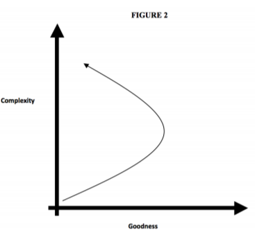
On this new slope, the design loses focus and coherence. It groans under the weight of too many accumulated elements. Where simplicity was once underwhelming, complexity becomes overwhelming. Where simplicity was once inadequate, complexity is now overdone. Goodness decreases.
Fortunately, there is an alternative to producing an unreadable book, an incoherent painting, or an inedible meal. With a little attention and focus, we can prevent complexity from reducing the design’s goodness.
It starts with adopting a mindful, reflective, deliberate approach, paying attention to the impact of each addition and resisting the sirens who try to lull us into a thoughtless, lazy mode of creation.
An empty vessel begs to be filled. A full one, in contrast, needs to be emptied. We would do well to learn to see the fullness of our designs. The Simplicity Cycle diagram aims to help us do precisely that, by shining a light on this particular bend in the path and providing a visual vocabulary to use when discussing this shift with our colleagues and collaborators.
But awareness of change is not enough. We must also be willing to change ourselves. Rather than continuing the additive behaviors that brought us thus far, it is time to adopt reductive approaches in order to improve the design.
When the vessel is full, we turn to new techniques, learn to use new tools, and find new ways to improve our creations. We focus on what should be removed rather than persisting with a narrower perspective that only sees what can be added. We explore the practice of creationthrough-subtraction, rather than continuing down the path of creation-through-addition. Here too the Simplicity Cycle can assist, by introducing and explaining some of these tools.
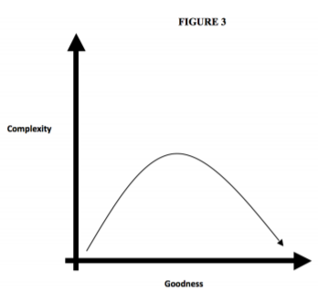
Figure 3 illustrates this approach. Upon arriving at the peak of complexity, we set aside, at least for the moment, our additive, expansive techniques and turn instead to the sculptor’s toolbox. Using metaphorical hammers and chisels, sanders and polishers, our creative mode now involves removing unnecessary protuberances rather than introducing new pieces, parts, and functions. We look for gears which grind against each other or turn without purpose. When we find them, we eliminate them, and find that the overall design is improved.
Do not underestimate the difficulty of this transition, but let us also not misunderstand the nature of the difficulty. The tools that move us down this new slope are intrinsically no harder to use than those which brought us up the first slope. They may actually be easier to use.
The difficulty comes in their novelty, their newness. They feel alien at first, awkward, when held in hands accustomed to creation-through-addition.
As with any tool, mastery takes time and familiarity. Mastery also requires humility.
When we are accomplished at working in one particular way, when we get good at it and have a proud track record to point to, the idea of becoming a novice again might feel unappealing. Who wants to use a new tool if it requires us to return to a state of decreased competence? Might it not be better—for our reputation, for our customers, for our partners—if we keep doing what we are good at, keep using the tools which have served us well so far? This is not wisdom’s voice calling us to stay the course. It is pride’s voice, calling us to protect ourselves, and it is not a voice worth listening to.
Inflexibility is itself a form of incompetence, and as Figure 2 showed, it has grave consequences.
Yes, the willingness to learn something new requires tolerating a temporary incompetence, but it is an awkwardness that leads to skill. Stubbornly refusing to do so, in contrast, may allow us to maintain our status as a Master… but only for a while. It is a dead-end, not an open door.
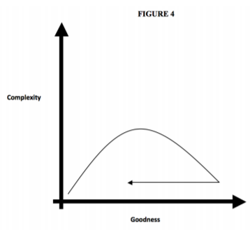
One final twist remains. Having apparently arrived at the Promised Land where Goodness is high and Complexity is low, we may be tempted to once again rest on our laurels and declare a permanent victory. Sadly, this is not to be.
Time exerts an inexorable pressure in the direction of decreased goodness. Today’s breakthrough becomes tomorrow’s commodity. Markets change, technologies change, needs and preferences and tastes change. Entropy happens. With each passing day our designs are nudged towards the left. Figure 4 shows what this does to our simple, good design.
The pace of change may vary but regardless of our circumstance, context, or discipline, goodness decreases over time. When we find ourselves returning to the lower left corner of this graph, it is time to once again seek out the blank page, the white canvas, the empty bowl. It is time to set aside the reductive tools and once again introduce new pieces, parts, functions, and ingredients as a way to improve the design.
To communicate a new idea.
To depict a new image.
To provide new flavors.
To produce any number of new creations.
And the cycle continues.


